According to consistent findings over the past decade, dyslexic‑friendly fonts still have a long way to go before they can be considered an asset to the dyslexic community.
What is dyslexia?
Between 10 and 20 per cent of Australians live with dyslexia, but what exactly is it? Translated from its Greek origins, dyslexia literally means ‘difficulty with words’.
Contrary to popular belief dyslexia is not a reading disability. It is a phonological deficit. Phonological meaning the sounds we associate with words. For a person with dyslexia, difficulty arises in connecting sounds with the letters on the page.
Dyslexia comes in many shapes and sizes. Some cases are passed down from parent to child, others are acquired through brain trauma. One person’s experience may vary wildly from another’s.
As there is no cure for dyslexia, it is vital to understand how we can best support
dyslexic readers.
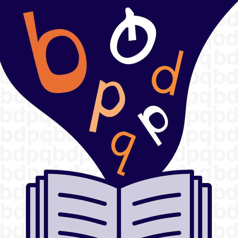
What is a dyslexic-friendly font?
Dyslexic‑friendly fonts are specifically designed for dyslexic readers. They abandon traditional typesetting techniques in favour of
a ‘dyslexia‑minded’ approach where differentiating similar letters (like b, d, p, q) is the leading principle of design.
There are several ways font designers attempt to achieve this. Some fonts, like Dyslexie, feature heavy set bottoms. Letters with heavy set bottoms create a baseline for the eye, a visual centre of gravity. This means a flipped ‘d’ can still be recogonised as an upside down ‘d’ rather than a ‘p’. Other techniques involve slanting letters and lengthening some letters’ sticks
The most notable fonts specifically designed for dyslexic readers are Dyslexie, OpenDyslexic, Read-Regular and Sylexiad.
How do you test the success of a dyslexic-friendly font?
Researchers use 3 factors to measure the success of a dyslexic‑friendly font:
- Does the font yield accurate readings?
- How long does the eye fixate on each letter/word?
- Given the choice between a standard font and a dyslexic‑friendly font, what would the reader prefer?
Researchers typically test the success of these 3 streams through focus groups. The focus groups are made up of both people with and without dyslexia. They are given a selection of similar texts written in a variety of fonts. The researchers use eye‑tracking technology to follow the relationship between the eye and the letters on the page. They also conduct follow‑up interviews to gain deeper understanding of the participants’ experience.
So, do dyslexic-friendly fonts work?
Despite the best intentions of designers, few studies endorse their altruistic efforts.
In a 2018 study, 317 primary-aged children (of which 272 were dyslexic) were provided texts written in 3 different fonts: Arial, Dyslexie and Times New Roman. The texts written in Dyslexie yielded neither more accurate readings nor shorter reading times than the Arial and Times New Roman texts. Not only did participants test better with Arial and Times New Roman, but they preferred them to Dyslexie. A 2013 study revealed similar results with OpenDyslexic, which improved neither readability nor comprehension.
On one hand, the results of these focus groups show that dyslexic‑friendly fonts don’t impede non‑dyslexic comprehension.
If a font is easier on the eye for a person with dyslexia, it’s guaranteed to be easier on the eye for a person without.
On the other hand, the results show that dyslexic‑friendly fonts haven’t been successful in delivering their promise.
These findings represent the consensus of most research. Some studies even go so far as to claim that dyslexic-friendly fonts do more of a disservice than benefit to the dyslexic community. The dyslexic community already face enough challenges and stigma without adding false hope and disappointment to the mix.
Tips for connecting with dyslexic readers
Whilst, for the time being, we can rule out dyslexic‑friendly fonts from our recommendations, font still matters. Stick to sans‑serif fonts, like Arial, Tahoma and Verdana, use 12‑to‑14‑point font sizing and avoid italics and underlining when possible.
Use section headings to ease document navigation. The British Dyslexia Association recommend making headings at least 20 per cent larger than the accompanying body text. The British Dyslexia Association also recommend adding extra spacing around headings and between paragraphs.
Monospacing is another key factor in delivering information in a dyslexic‑friendly way. Monospacing is when the letters and characters on a line each occupy the same amount of horizontal space (as opposed to varying the spacing from character to character). Aim for a spacing of 35 per cent of the average letter width.
The International Dyslexia Association also recommends taking a ‘multi-sensory approach’ that engages multiple senses.
For example, combining text with pictorial content or sound.
And, of course, the Information Access Group are always eager to help you connect with your audience in the most clear, concise and accessible way possible.